Basic Charts
Intro
Charts in roboquant are all based on matplotlib. Either by directly invoking methods or via the Pandas DateFrame df.plot() method.
This page shows how to use the included and customize the included charts that come with roboquant.
Styles
Roboquant has a light and dark style for the charts, which can be enabled by calling the set_dark_style() and set_light_style() function.
Besides the dark background, it also sets some other parameters for the charts, like the figure size, dpi and grids.
import roboquant as rq

rq.set_light_style()
rq.set_dark_style()
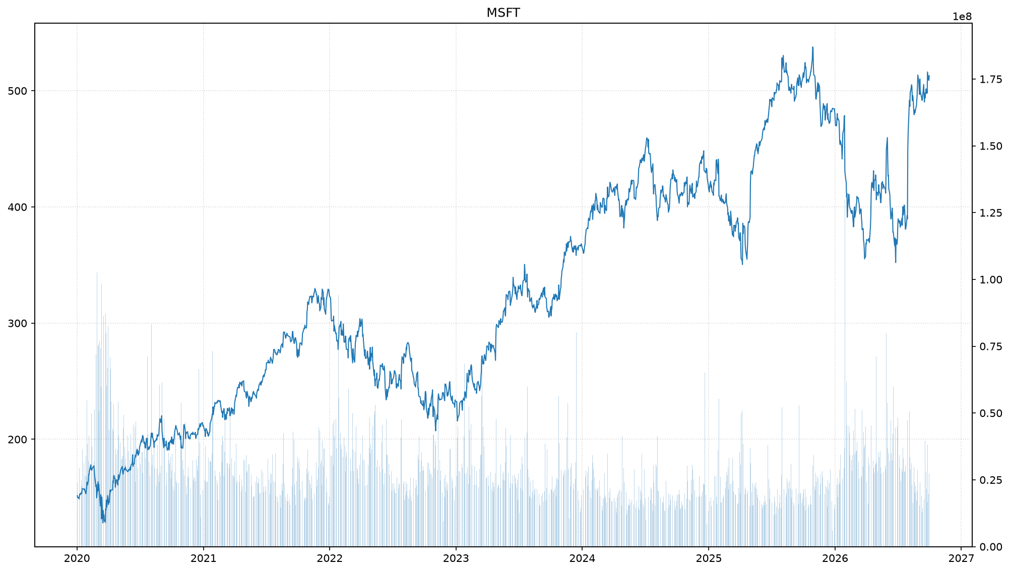
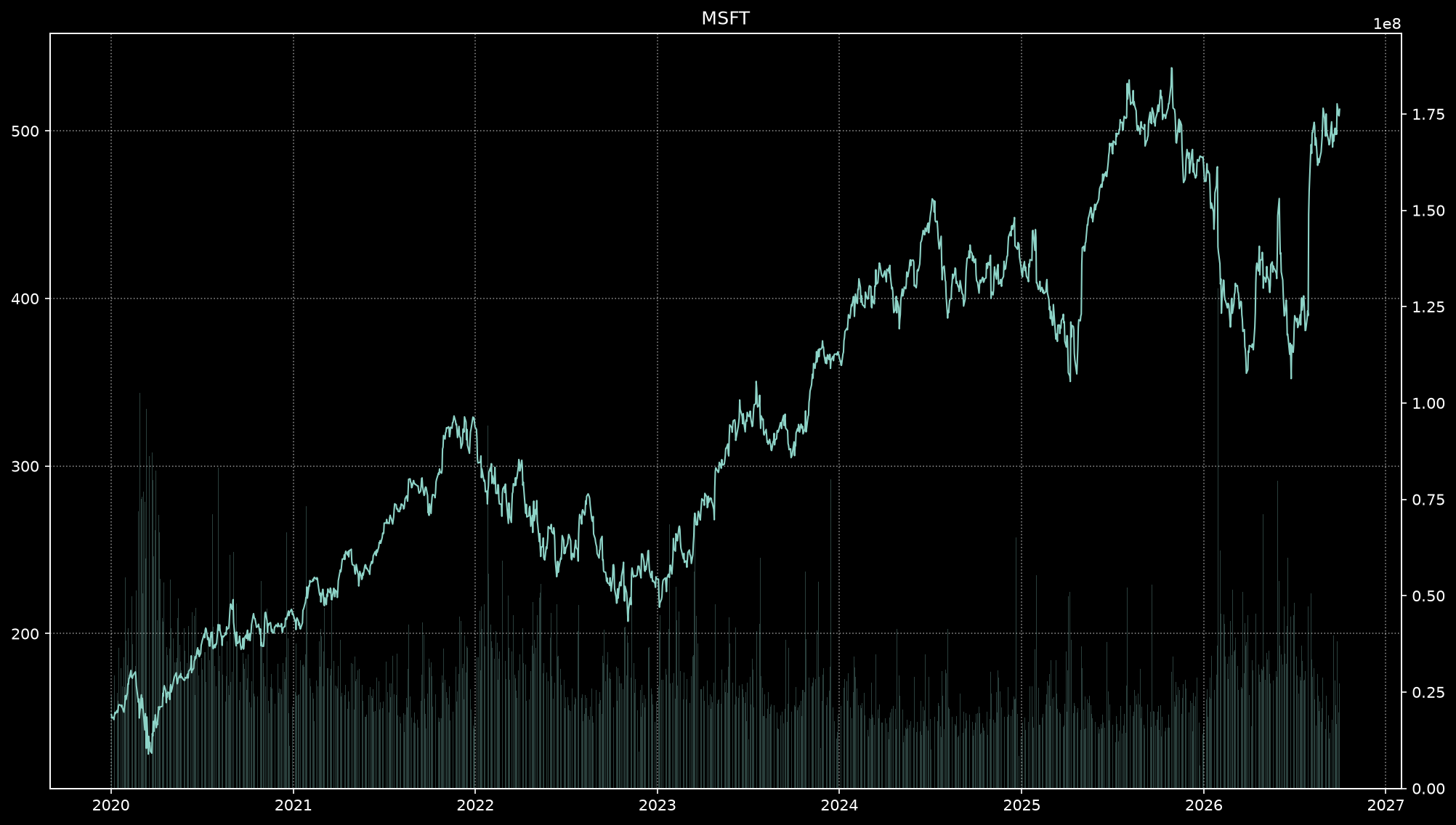
The following charts shows these two styles in action.
Light style
Great for exporting to PDF and printing.
Dark style
Great for developing late at night or in a dark mode editor.
Examples
The following charts use the YahooFeed to fetch historical data for several assets and then runs a
simple EMA Crossover strategy.
We start with importing the required packages and setting some defaults.
import roboquant as rq
import matplotlib.pyplot as plt

# Setup some defaults for matplotlib
rq.set_light_style()
Then we load the prices of 8 very different assets to make the results a bit more interesting.
feed = rq.feeds.YahooFeed("MSFT", "F", "GLD", "GSG", "BND", "LQD", "IBIT", "VIXY")Price Chart
Plot a price and optionally the volume for one of the assets in the feed.
feed.plot("MSFT");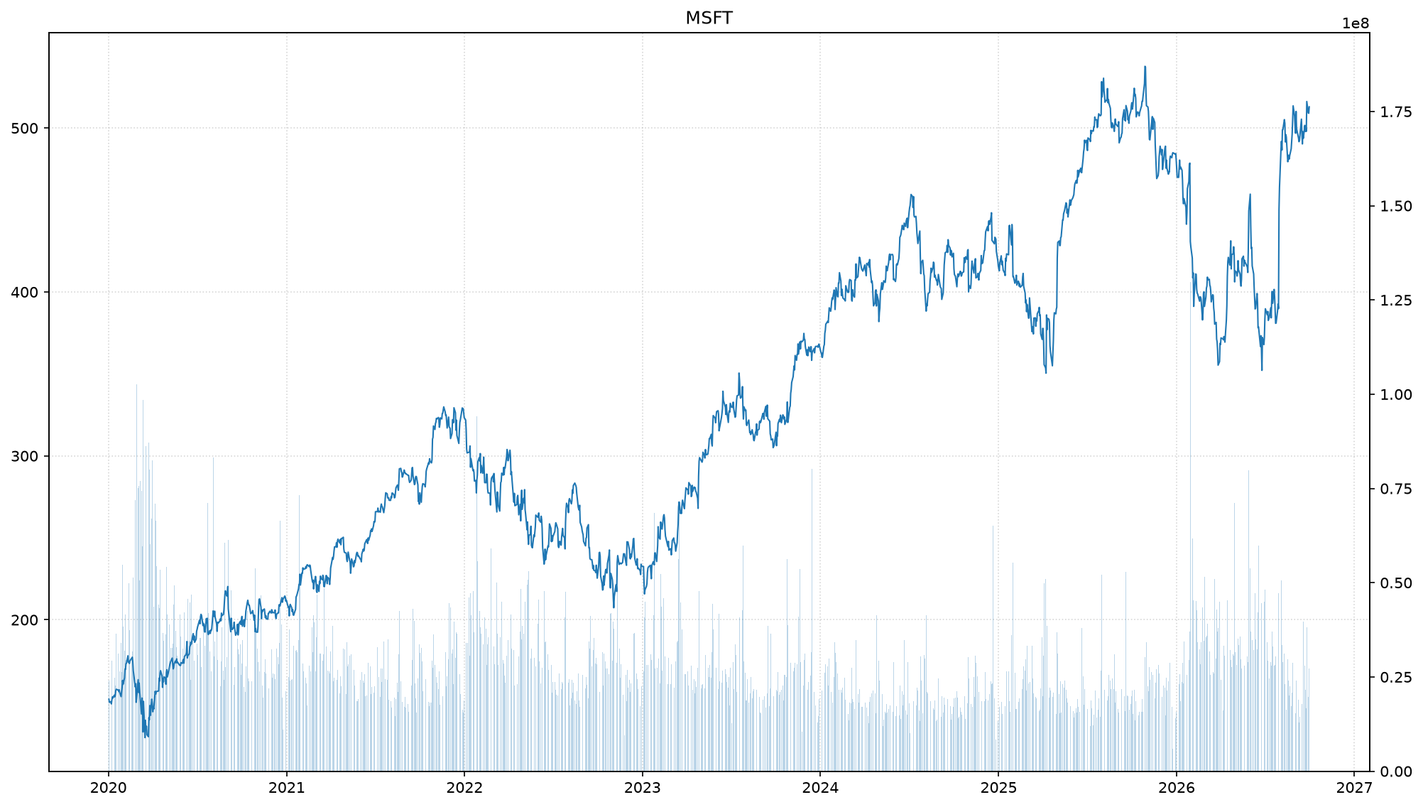
Or plot multiple assets in the same chart as seperate series.
ts = feed.to_timeseries("F", "GLD", "LQD", "MSFT")

# normalize all values so we can compare them in a chart
ts.normalize()
ts.plot();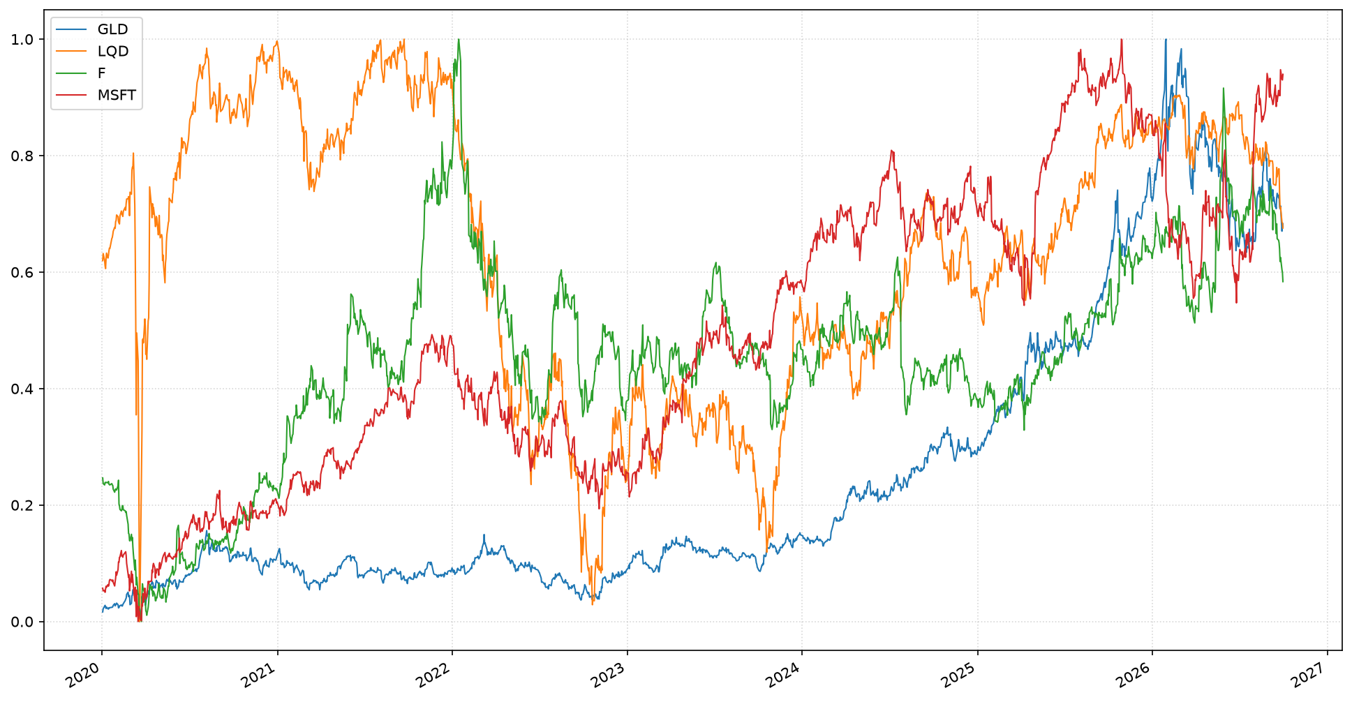
Or plot the same series in a 3-D chart.
ts.plot_3d();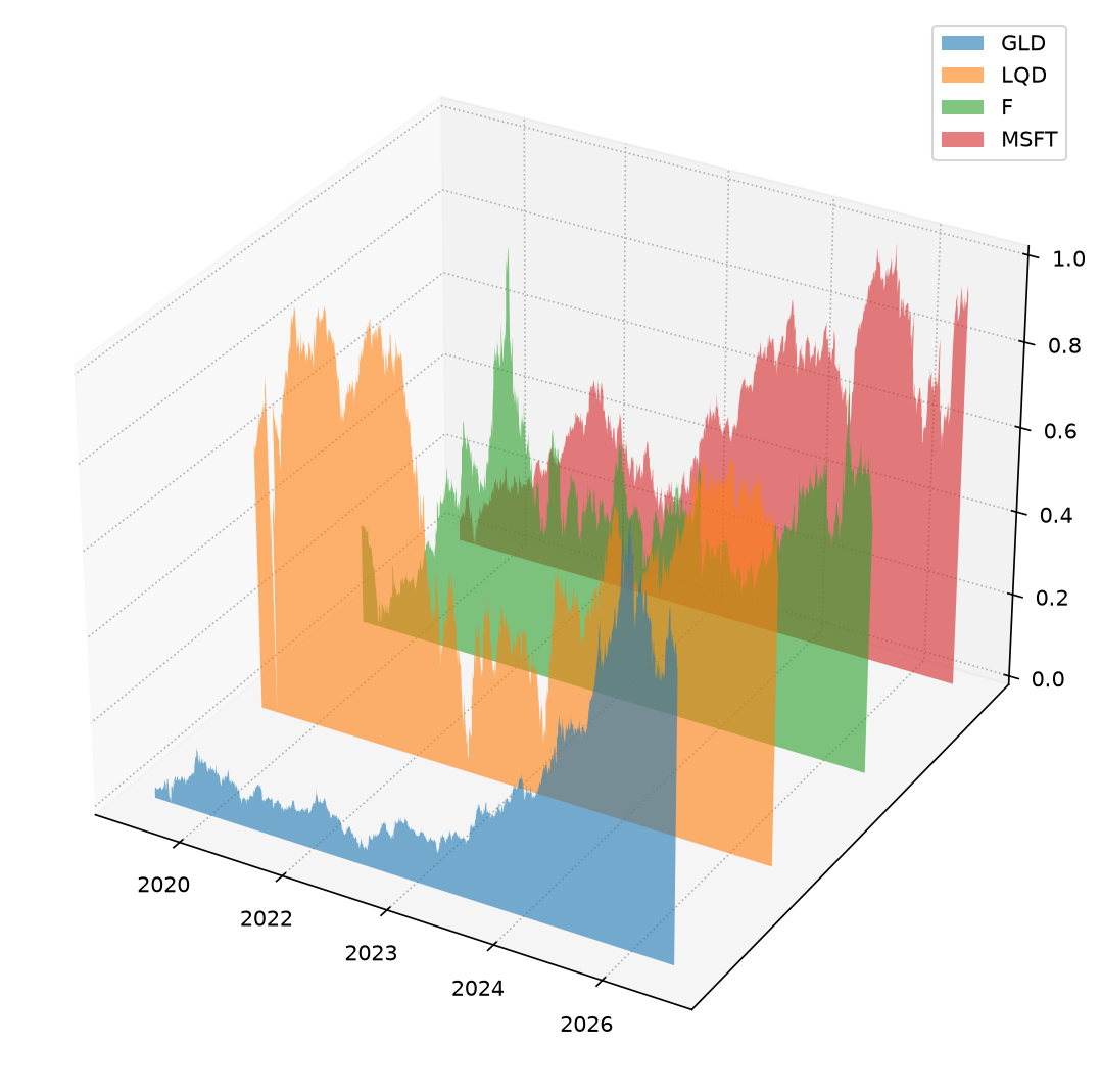
Correlation Chart
Sometimes it is useful to inspect the correlation between the assets we want to trade in. There is a special plot method available that makes this visible.
feed.to_timeseries().plot_corr(fontsize=7);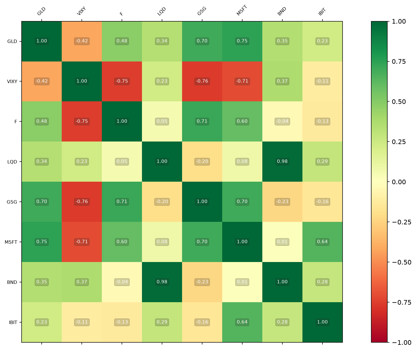
Once we run a backtest we can plot the account related charts and charts for any metrics we captured.
In the code snippet below the MetricsJournal.pnl() will capture metrics like
the total equity at each step of the run.
strategy = rq.strategies.EMACrossover()
journal = rq.journals.MetricsJournal.pnl()
account = rq.run(feed, strategy, journal=journal)
Trade Chart
A price chart can also show the trades with added markers for when trades for that asset took place. A red down-pointing triangle for a SELL trade and a green up-pointing triangle for a BUY trade.
The feed.plot method will autimatically filter for the right asset and timeframe of the trades.
tf = rq.Timeframe.previous("365 days")
feed.plot("MSFT", timeframe=tf, trades=account.trades);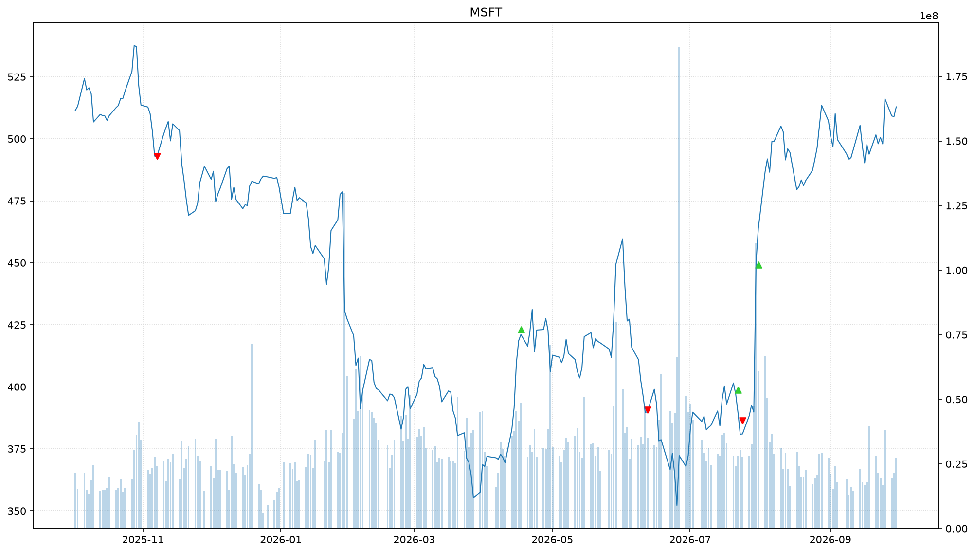
Metric Chart
Equity is a good example of a metric that is useful to capture during a run. It provides insights how the total equity is evolving during a run and shows also the volatility of our strategy when it comes to returns.
equity = journal.get_metrics("pnl/equity")
equity.plot();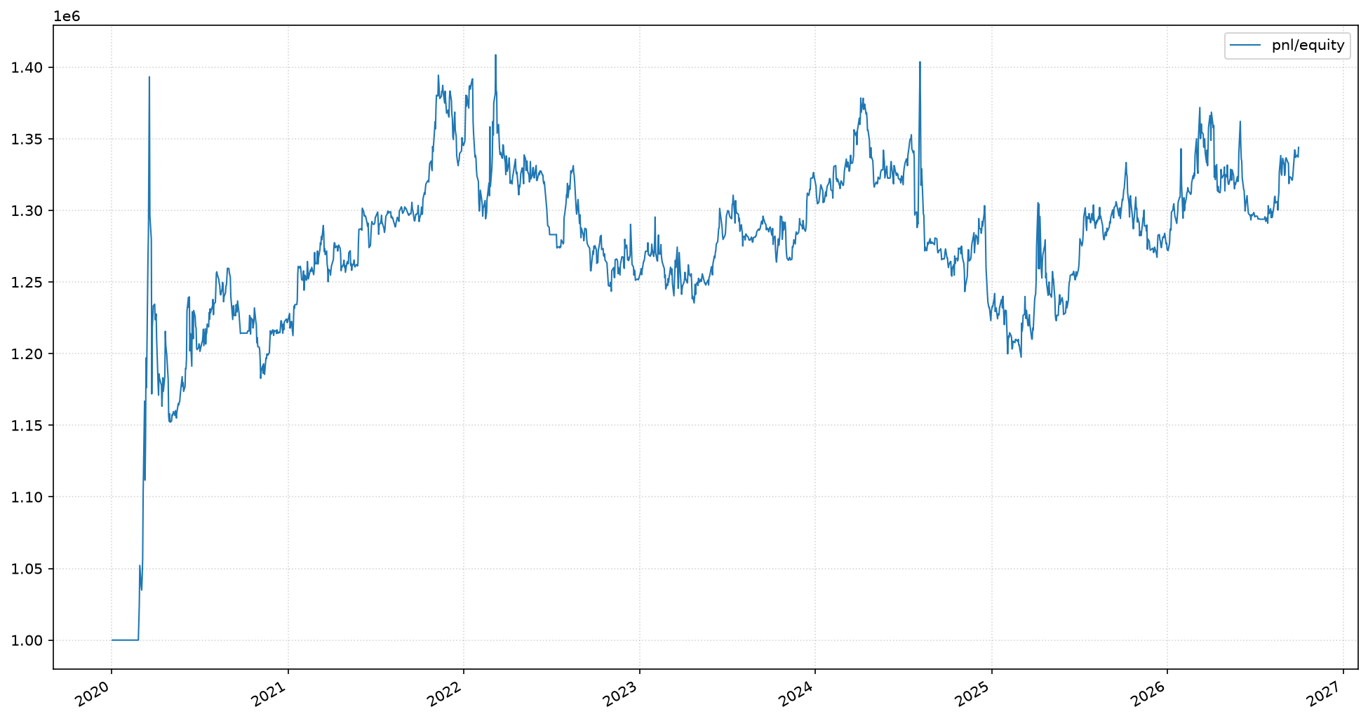
Asset Allocation Chart
For larger number of open positions it is useful to see which percentage is allocated to which asset.
Since assets can be denoted in different currencies, roboquant takes care of converting them to a single currency before plotting. Also in case of hedging positions, they will be first netted before plotting.
_, ax = plt.subplots(figsize=(3, 3))
account.plot_allocation(include_cash=True, ax = ax);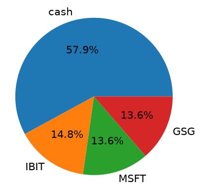
Custom Chart
You can customize many of the plots by providing parameter arguments that will be passed on to the matplotlib functions. You can also add some more lines to the plot.
equity = journal.get_metrics("pnl/equity")
ax = equity.plot(color="green")

ax.axhline(equity["pnl/equity"].mean(), linestyle="--")
equity.rolling(50).mean().plot(ax=ax, color="red")
ax.set_title("My Custom Title");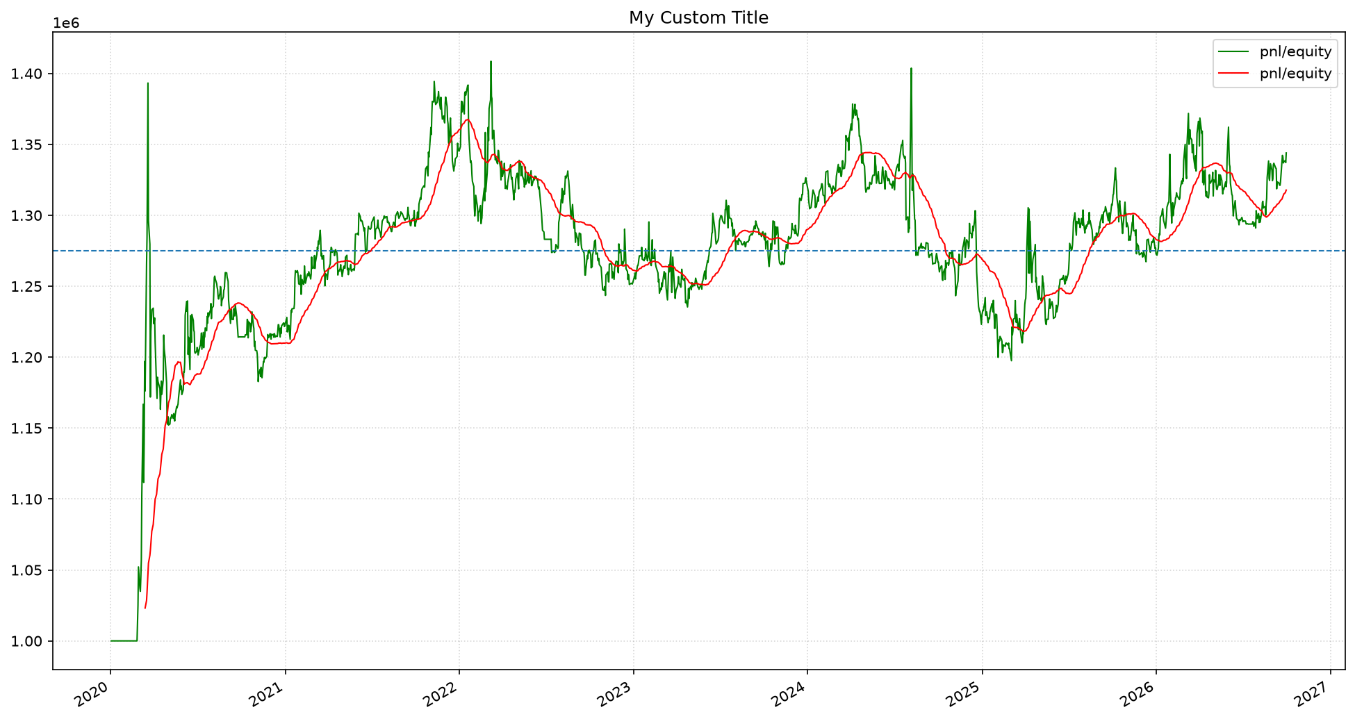
Custom Layout
Or you can take full control of the layout and create more advanced chart figures. Below we create a figure with 8 subplots. We also create a more informative title.
tf = rq.Timeframe.previous("365 days")
_, axs = plt.subplots(4, 2, figsize=(20, 30))

for ax, asset in zip(axs.flatten(), feed.assets()):
    pnl = account.pnl(asset)
    ax = feed.plot(asset, timeframe=tf, ax=ax, trades=account.trades)
    ax.set_title(f"{asset.symbol} ({pnl:,.0f})")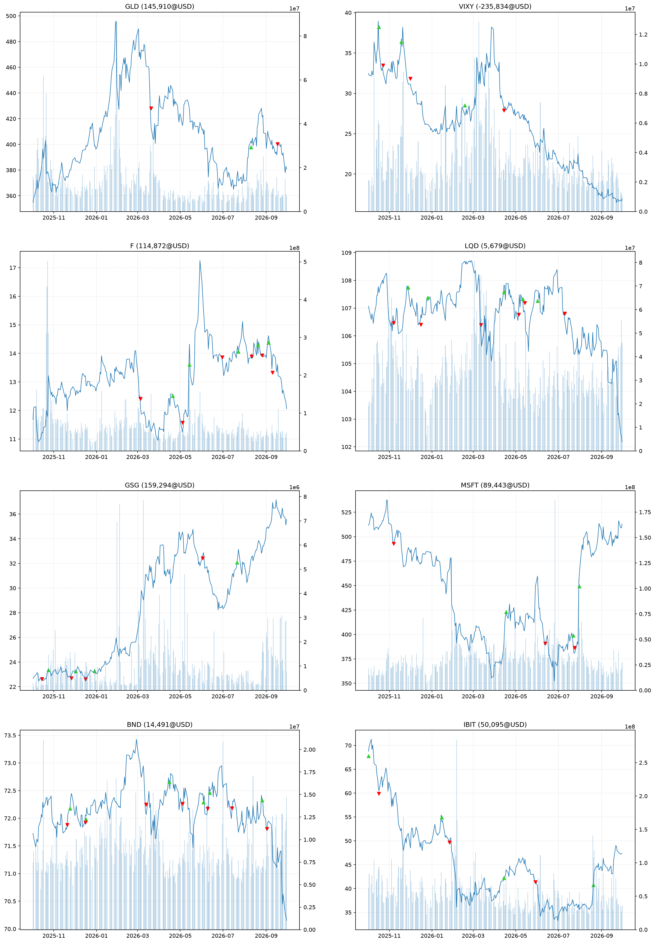
Multi-run
Rather that running a single back test, we can also run multiple back tests and plot the results on the same chart. This is useful to see how the strategy performs over different timeframes or with different hyper-parameters.
One pattern we use to plot multiple runs on the same chart is:
ax = None
for i in some_range:
    ...
    ax = something.plot(ax=ax, ....)
The first time the plot method is invoked, ax is None and the plot method will create a new figure and axis. It will return this axis, so that next time the plot method is invoked it will plot on the existing axis.
Walk Forward
Perform a walk-forward over 4 equal timeframes and plot the equity curve of each run on the same chart.
timeframes = feed.timeframe().split(4)
ax = None

for timeframe in timeframes:
    strategy = rq.strategies.EMACrossover()
    journal = rq.journals.MetricsJournal.pnl()
    rq.run(feed, strategy, journal=journal, timeframe=timeframe)
    equity = journal.get_metrics("pnl/equity")
    ax = equity.plot(ax=ax, legend=False)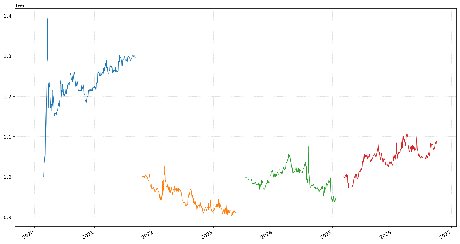
Sample Random Timeframes
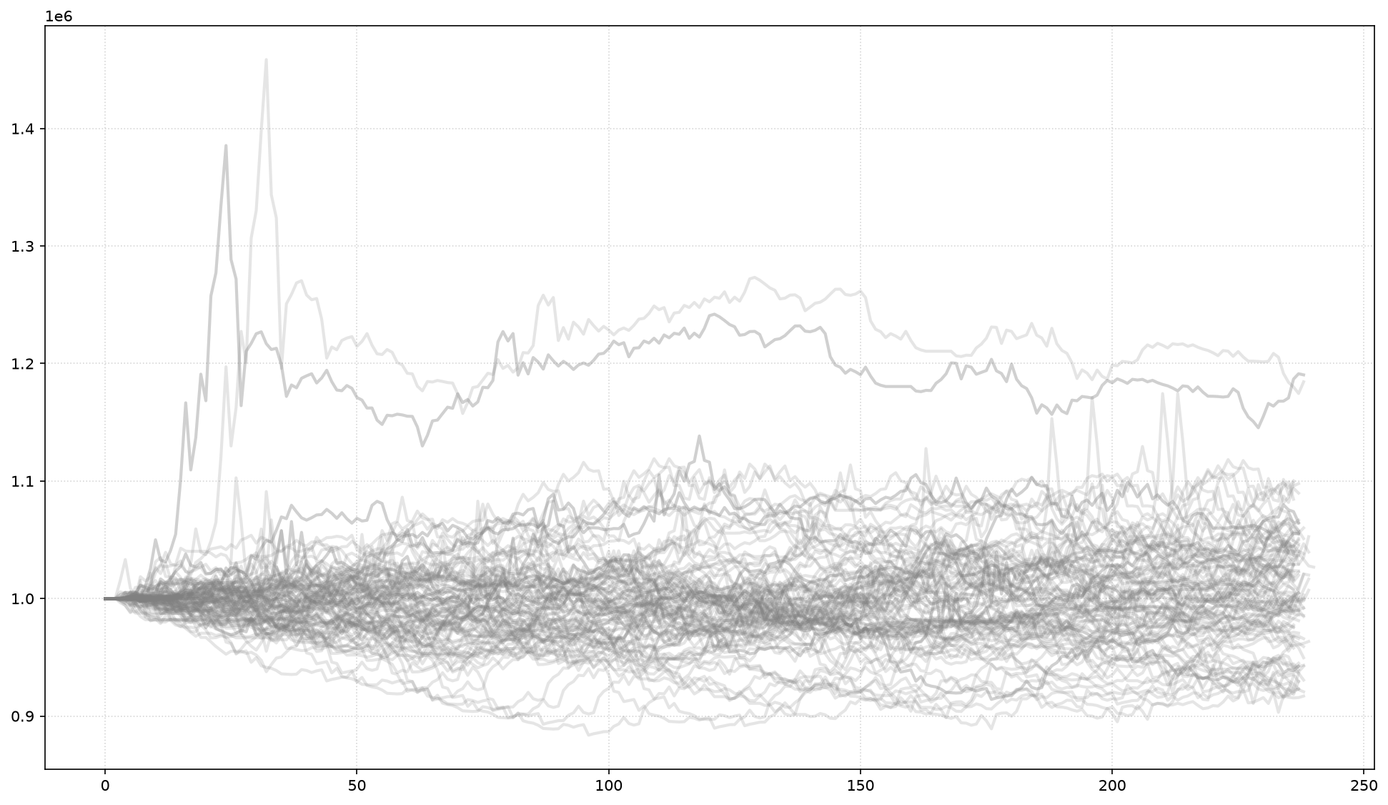
Run randomly sampled 1-year back tests and plot the equity curve for each run on the same chart. This provides visual insights how the equity curves are distributed.
timeframes = feed.timeframe().sample(100, "365 days")
ax = None

for timeframe in timeframes:
    strategy = rq.strategies.EMACrossover(5, 13)
    journal = rq.journals.MetricsJournal.pnl()
    rq.run(feed, strategy, journal=journal, timeframe=timeframe)

    # Skip the first 13 trading days since the strategy is still
    # warming up and the equity curve is flat during this period.
    equity = journal.get_metrics("pnl/equity")[13:]

    ax = equity.plot_without_timeline(
            ax=ax, linewidth=2, color="grey", alpha=0.2, legend=False
         )
Hyper Parameter Tuning
Sometimes it can be helpful to visualize the results of different configurations for certain parameters.
In the code below we run back tests with different configuration for the EMACrossover strategy. At the end of each run we join the equity metric for that run with the ones from previous runs.
it is important that the columns in the timeseries have unique names.
feed = rq.feeds.YahooFeed.us_stocks_10(start_date="2010-01-01")

params = [(2,5), (5,7), (7,11), (9,17), (13,26), (20, 50), (30, 70)]
equities = rq.TimeSeries()
for fast, slow in params:
    strategy = rq.strategies.EMACrossover(fast, slow)
    journal = rq.journals.MetricsJournal.pnl()
    account = rq.run(feed, strategy, journal=journal)
    column_name = f"ema-{fast}/{slow}"
    equity = journal.get_metric("pnl/equity", column_name)
    equities = equities.join(equity, how="outer")
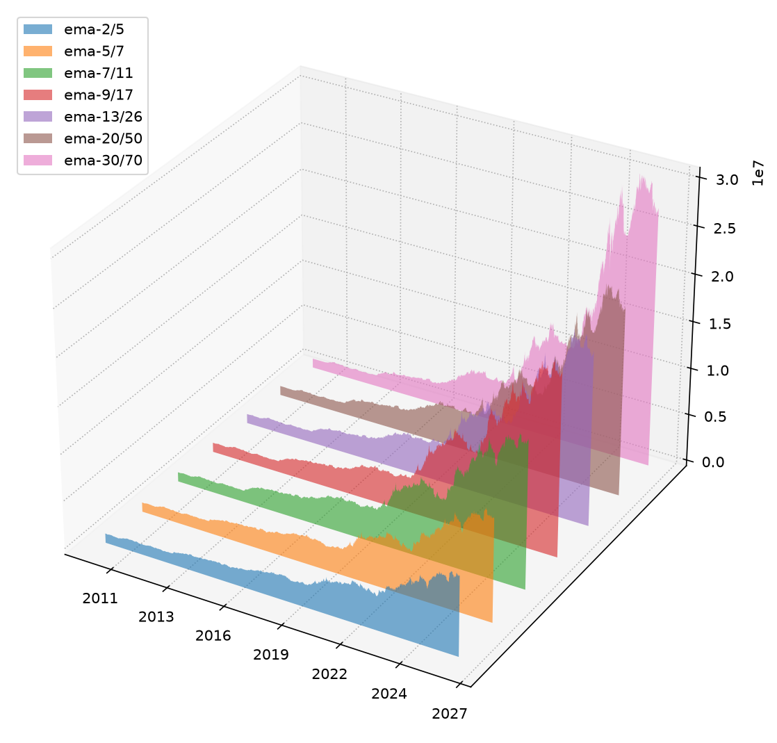
Now we plot the equity curves of each run on a single 3-D chart.
equities.plot_3d();