Custom Charts
Introduction
Often you want to visualize some metrics that are specific to your strategy and approach to developing algo-trading solutions.
This example shows how to approach such a scenario. It is more meant as inspiration than a ready-to-use solution, but it should give you a good idea of how to use the roboquant framework to create your own highly customized charts.
This example shows how to use some IndicatorMetrics and the SignalRatingMetric to track indicators and signals on a chart.
It uses the YahooFeed to get the data for TSLA and plots the price, Bollinger Bands, RSI, and buy/sell signals on a chart.
We start with importing the required packages and modules.
import roboquant as rq
import matplotlib.pyplot as plt

from roboquant.util.metrics import SignalRatingMetric, BBandsMetric, RSIMetric
from roboquant.util.indicators import BBANDS, RSI

# set a default style
rq.set_light_style()
Like always, we need to create a feed to get the data for the chart. In this case we use the YahooFeed to get the data for Tesla for the year 2025.
feed = rq.feeds.YahooFeed("TSLA", start_date="2025-01-01", end_date="2026-01-01")
asset = feed.get_asset("TSLA")Layout
We now define the figure and axes for the chart. We use a 3 row layout, with the first row for the price and Bollinger Bands, the second row for the RSI, and the third row for the buy/sell signals. The first row is 4 times the height of the other rows, to give more space for the price chart.
fig, (ax1, ax2, ax3) = plt.subplots(nrows=3, sharex=True, height_ratios=[4,1,1])Price Chart with Bollinger Bands
Let’s plot the price and Bollinger Bands on the first axis. We use the track method of the feed to track the Bollinger Bands metric, which returns a TimeSeries DataFrame with the lower and upper bands.
# plot the prices first, without the volume.
feed.plot(asset, ax=ax1 , plot_volume=False)

metric = BBandsMetric(asset, timeperiod=10)
bbands = feed.track(metric)

ax1.fill_between(bbands.index, bbands["bbands/lower"], bbands["bbands/upper"], alpha=0.4, color="grey")
ax1.set_title(asset.symbol)
RSI Chart
Now we plot the RSI on the second axis. We use again the track method of the feed to track the RSI metric, which returns a TimeSeries DataFrame with the RSI values. We also add horizontal lines at 70 and 30 to indicate overbought and oversold conditions.
rsi = feed.track(RSIMetric(asset, timeperiod=10))
rsi.plot(ax=ax2)

ax2.axhline(70, color="red", linestyle="--")
ax2.axhline(30, color="green", linestyle="--")
ax2.set_yticks([])
ax2.grid(axis='y')
ax2.legend()
Buy/Sell Signals Chart
Finally, we plot the buy/sell signals on the third axis. We use the SignalRatingMetric to track the signals generated by an EMA Crossover strategy. The metric returns a TimeSeries DataFrame with the ratings for each signal, which we use to plot the buy and sell signals as green and red bars respectively.
strategy = rq.strategies.EMACrossover(2, 5)
metric = SignalRatingMetric(asset, strategy = strategy)

ratings = feed.track(metric)
buy_ratings = ratings[ratings["rating/tsla"] > 0]
sell_ratings = ratings[ratings["rating/tsla"] < 0]

ax3.bar(buy_ratings.index, buy_ratings["rating/tsla"], color="green", label="buy")
ax3.bar(sell_ratings.index, sell_ratings["rating/tsla"], color="red", label="sell")
ax3.legend()Plot
Now we can adjust the layout of the figure to make sure the subplots don’t overlap and display the chart.
fig.tight_layout(h_pad=0)
fig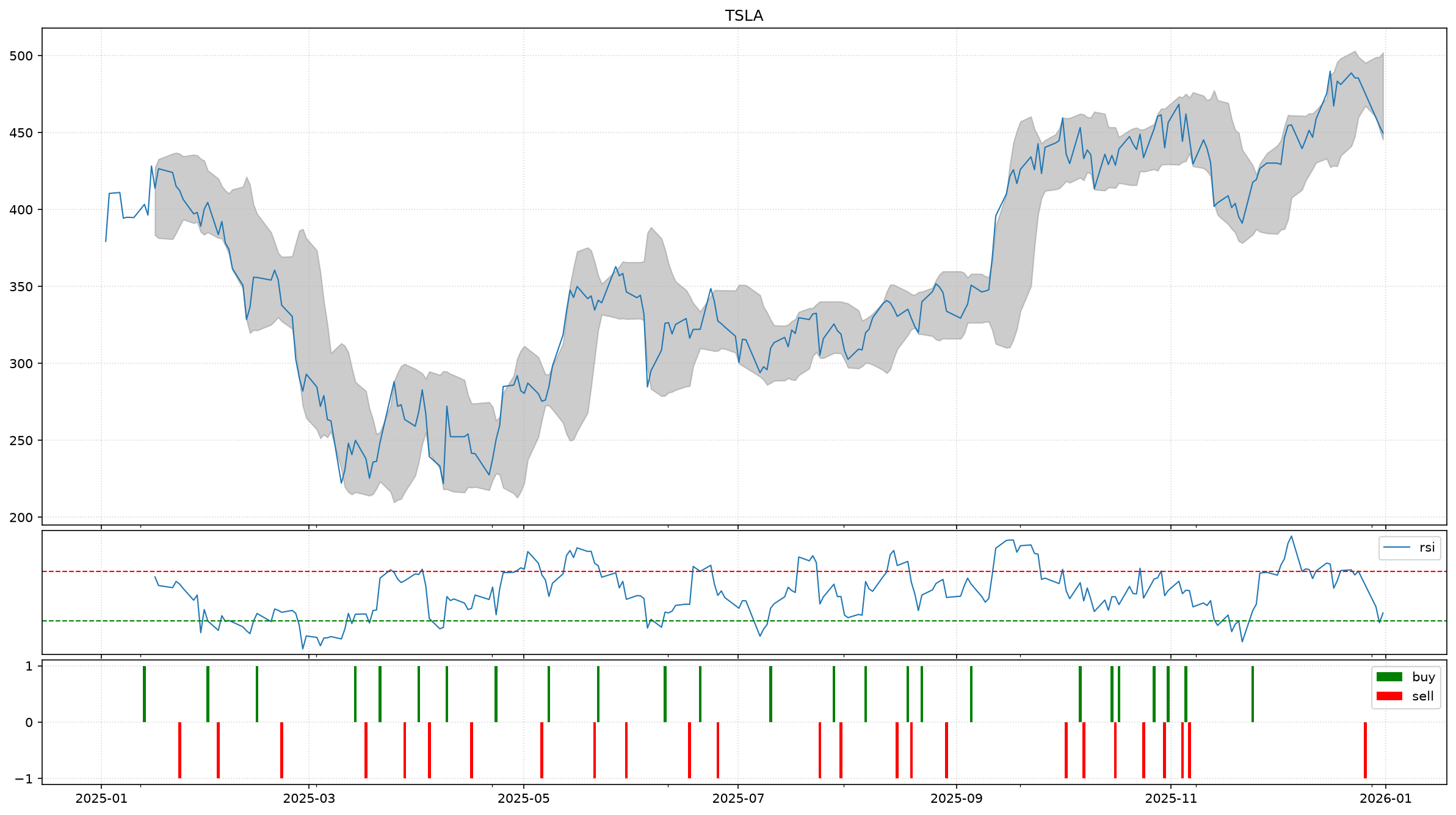
Next Steps
Based on this example you can create your own custom charts to visualize any metrics you want.
You can also use the plot method of the feed to plot multiple assets on the same chart, or use the plot method of the metric to plot the metric values directly.
You can then combine these plots to create more complex charts and package them into a Chart class that can be reused in your own strategies and backtests.