Charts
If you have a Google account, you can run this Jupyter Notebook on Google Colab: 
Introduction
This tutorial shows how to draw certain charts using roboquant.
It uses the YahooFeed to fetch historical data for several assets and then runs a
simple EMA Crossover strategy. The results are visualized using the matplotlib library
and the roboquant plotting capabilities.
# Install roboquant
%pip install --quiet --upgrade roboquant
Note: you may need to restart the kernel to use updated packages.
import roboquant as rq
import matplotlib.pyplot as plt
The roboquant library provides convenient functions to quickly set default styles for matplotlib plots. rq.set_light_style() configures charts with a light theme, which is often preferred for presentation. You can uncomment rq.set_dark_style() if you prefer a darker aesthetic.
rq.set_light_style()

# uncommon following line if you prefer dark styled charts
# rq.set_dark_style()
Feed
We create a YahooFeed to fetch historical stock data for several assets. We’ve included a mix of individual stocks (MSFT, F), precious metals (GLD), commodities (GSG), and bonds (BND, LQD), along with Bitcoin ETF (IBIT) and volatility index (VIXY), to represent a diversified feed for our backtesting.
feed = rq.feeds.YahooFeed("MSFT", "F", "GLD", "GSG", "BND", "LQD", "IBIT", "VIXY")Before running a strategy, it’s often useful to inspect the historical price data for individual assets. The feed.plot('MSFT') command quickly generates a price chart for Microsoft stock, allowing us to visualize its historical performance.
feed.plot("MSFT");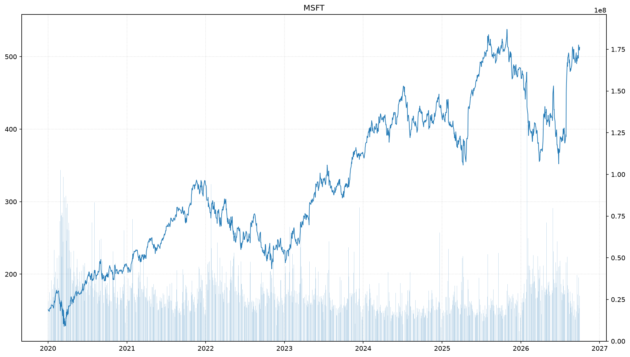
Backtesting a Strategy
Now we will define and run a trading strategy.
strategy = rq.strategies.EMACrossover()
journal = rq.journals.MetricsJournal.pnl()
account = rq.run(feed, strategy, journal=journal)
print(account)
buying power : 778,574@USD
cash : 778,574@USD
equity : 1,343,951@USD
positions : 5113@GSG, 357@MSFT, 4135@IBIT
trades : 381
mkt value : 565,377@USD
orders : none
last update : 2026-09-30 04:00:00+00:00
Here, we instantiate an EMACrossover strategy, which typically generates signals based on the crossing of two EMAs (e.g., a short-term EMA crossing a long-term EMA). We also set up a MetricsJournal.pnl() to track the profit and loss (PnL) metrics during the backtest. Finally, rq.run() executes the backtest over the historical data provided by the feed, applying the strategy, and recording results in the journal. The account object returned contains the final state of the simulated trading account.
account.plot_allocation(include_cash=True);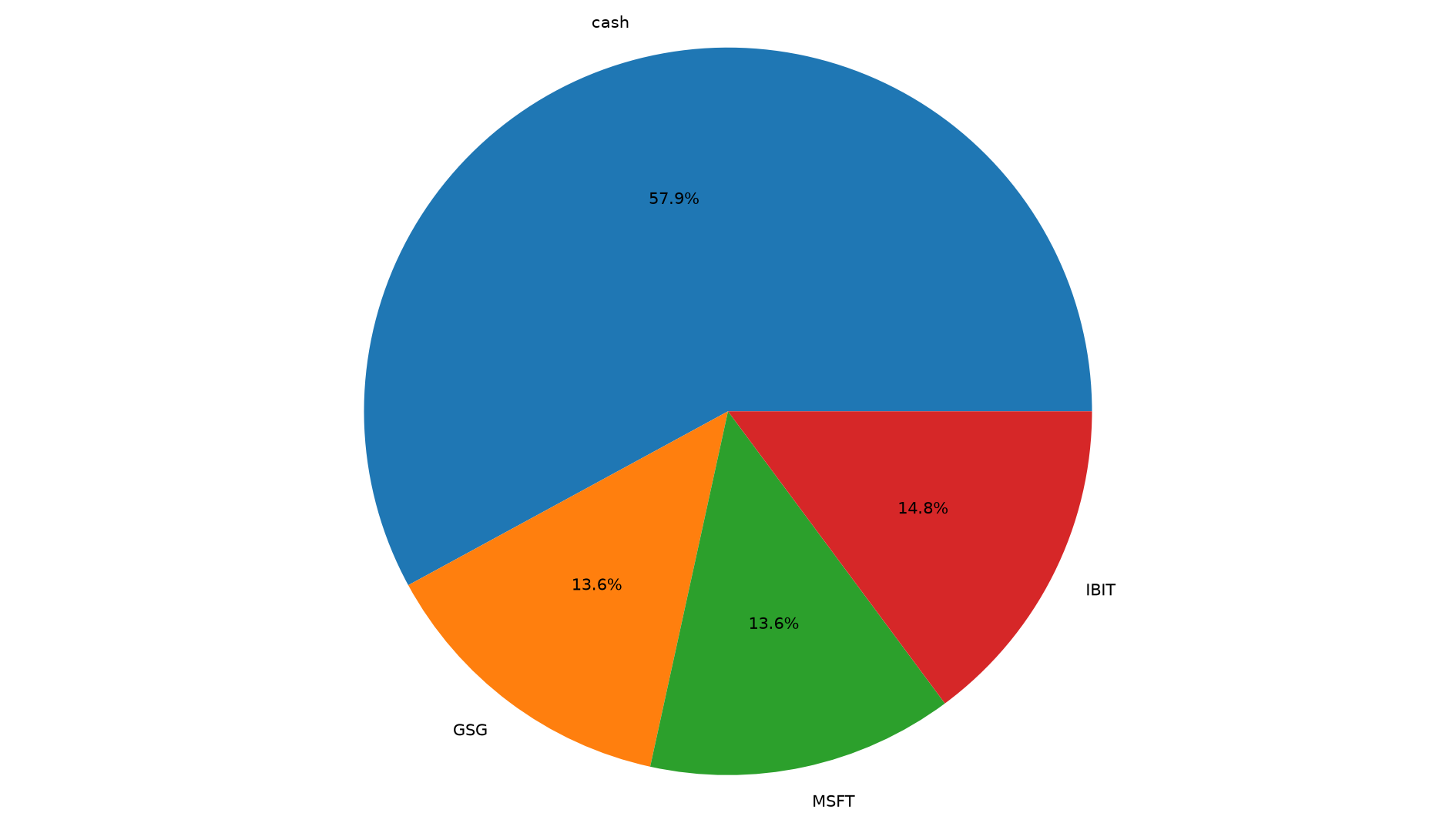
Visualizing the allocation of assets over time is crucial for understanding risk and diversification. account.plot_allocation(include_cash=True) generates a chart showing how the capital was distributed among different assets, including cash, at the end of the backtest period.
Customize
You can customize many of the plots by providing parameter arguments that will be passed on to matplotlib.
equity = journal.get_metrics("pnl/equity")[-100:]
ax = equity.plot(color="green", linestyle="--", marker='o')
ax.set_title("My Custom Title");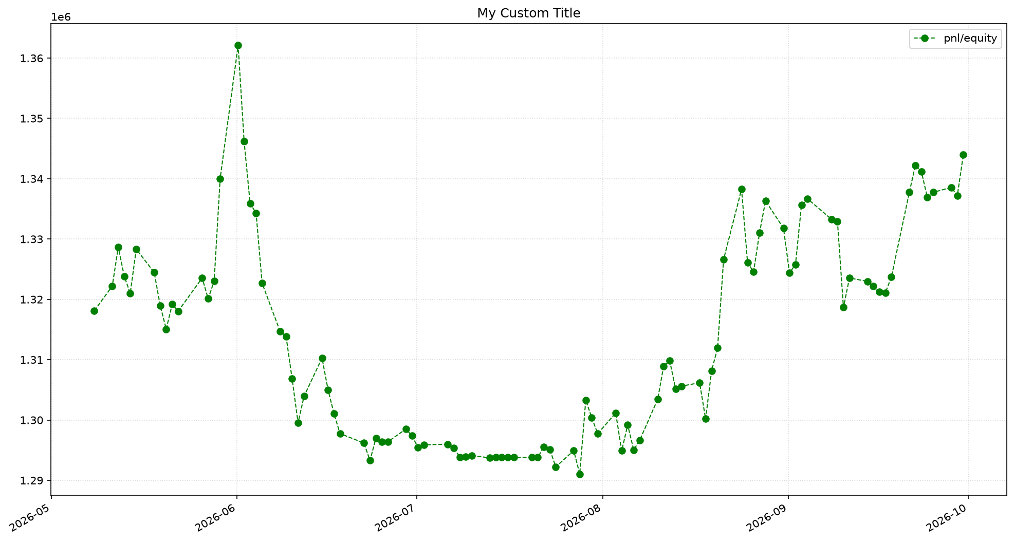
After retrieving the equity curve from the journal, we can plot it. Here, we select the last 100 data points of the pnl/equity metric, customize its appearance with a green dashed line and circular markers, and set a custom title using ax.set_title(). This demonstrates how to directly interact with matplotlib axes returned by roboquant plotting functions.
Or you can take full control of the figure and axes and create more advanced chart figures.
Below we plot the equity curve and its 20-day rolling standard-deviation
fig, (ax1, ax2) = plt.subplots(nrows=2, sharex=True, height_ratios=[4,1])
equity = journal.get_metrics("pnl/equity")
equity.plot(ax=ax1)
equity_std = equity["pnl/equity"].rolling(20).std()
equity_std.plot(ax=ax2, label="std", legend=True)
fig.tight_layout();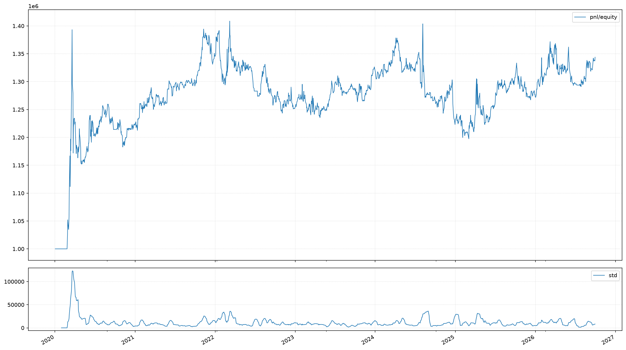
For more advanced visualizations, you can create your own matplotlib figure and axes. Here, we create a figure with two subplots: ax1 for the equity curve and ax2 for its 20-day rolling standard deviation. sharex=True ensures both subplots share the same x-axis, which is the timeline. height_ratios adjusts the relative heights of the subplots. This setup is useful for comparing metrics that evolve over the same period.
Below we create a figure with 8 subplots with a more infomative title.
tf = rq.Timeframe.previous("365 days")
_, axs = plt.subplots(4, 2, figsize=(20, 30))

for ax, asset in zip(axs.flatten(), feed.assets()):
    pnl = account.pnl(asset)
    ax = feed.plot(asset, timeframe=tf, ax=ax)
    ax.set_title(f"{asset.symbol} ({pnl:,.0f})")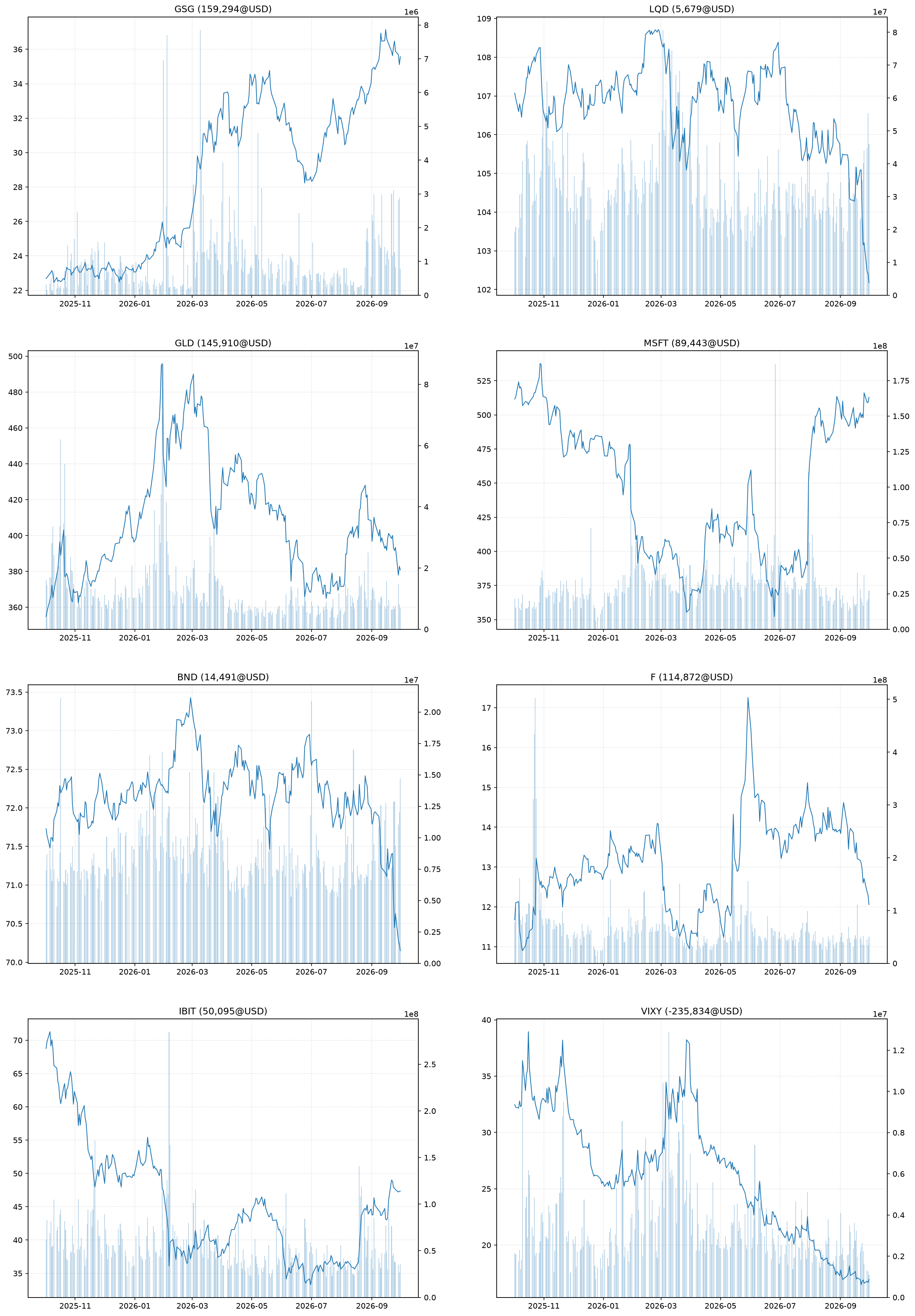
This code block generates a multi-panel plot to visualize the price action and trades for each individual asset. We define a Timeframe for the previous 365 days. A loop iterates through each asset in the feed, creating a separate subplot for each. For each asset, it plots its price history, overlaying the trades executed by the strategy, and sets an informative title that includes the asset symbol and its PnL. This provides a detailed view of how the strategy performed on an asset-by-asset basis.
Multi-run
Walk-Forward Optimization
Walk-forward optimization is a technique used to validate trading strategies by repeatedly backtesting them on sequential, non-overlapping periods. Here, we split the total feed timeframe into 4 equal segments. For each segment, we re-run the EMACrossover strategy and plot the equity curve. Plotting all these curves on the same chart allows us to visually inspect the consistency of the strategy’s performance across different market phases.
timeframes = feed.timeframe().split(4)
ax = None

for timeframe in timeframes:
    strategy = rq.strategies.EMACrossover()
    journal = rq.journals.MetricsJournal.pnl()
    rq.run(feed, strategy, journal=journal, timeframe=timeframe)
    equity = journal.get_metrics("pnl/equity")
    ax = equity.plot(ax=ax, legend=False)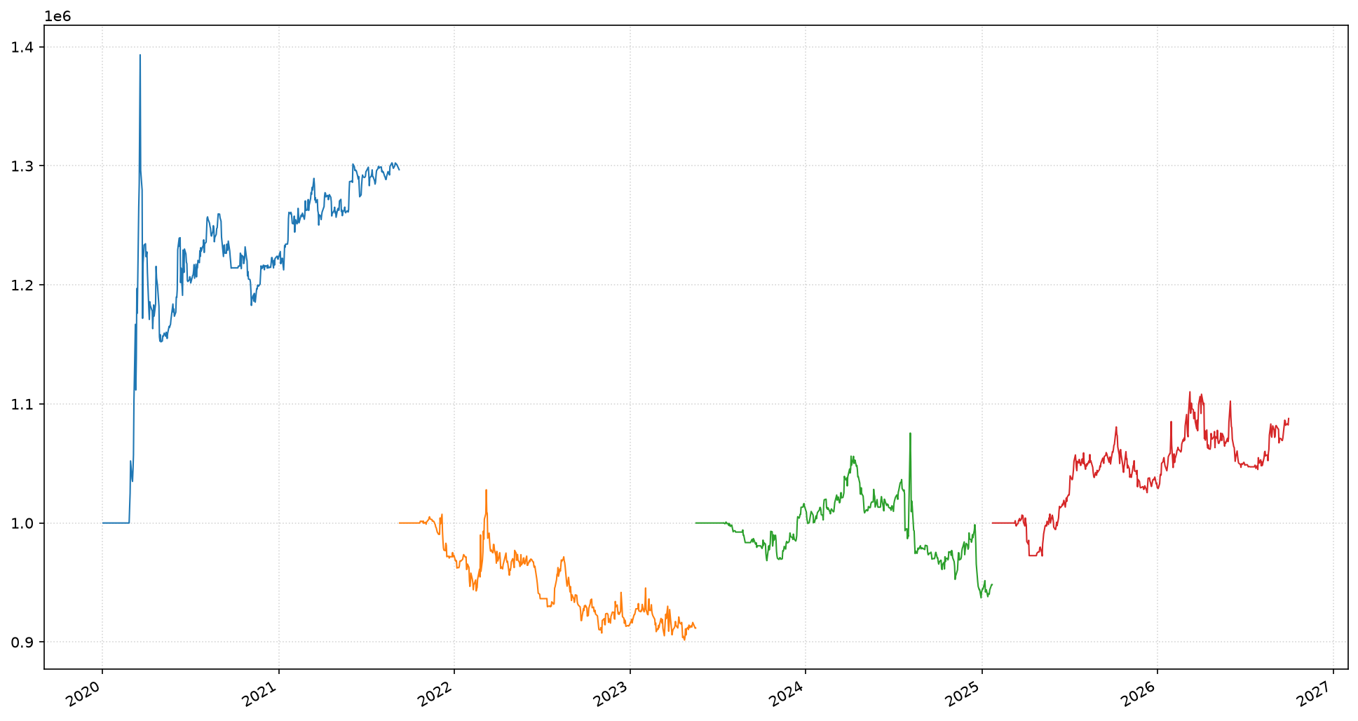
Monte Carlo Simulation for Backtesting
To get a robust understanding of strategy performance, it’s beneficial to run multiple backtests over randomly sampled timeframes. Here, we sample 100 different 1-year periods from the historical data. For each sampled timeframe, we run the EMACrossover strategy and plot its equity curve. By visualizing all these equity curves together, we can see the distribution of potential outcomes, providing insights into the strategy’s robustness and sensitivity to different market conditions. We skip the first few days to allow the strategy’s indicators to warm up.
timeframes = feed.timeframe().sample(100, "365 days")
ax = None

for timeframe in timeframes:
    strategy = rq.strategies.EMACrossover(5, 13)
    journal = rq.journals.MetricsJournal.pnl()
    rq.run(feed, strategy, journal=journal, timeframe=timeframe)

    # Skip the first 13 trading days since the strategy is still
    # warming up and the equity curve is flat during this period.
    equity = journal.get_metrics("pnl/equity")[13:]
    ax = equity.plot_without_timeline(ax=ax, linewidth=2, color="grey", alpha=0.2, legend=False)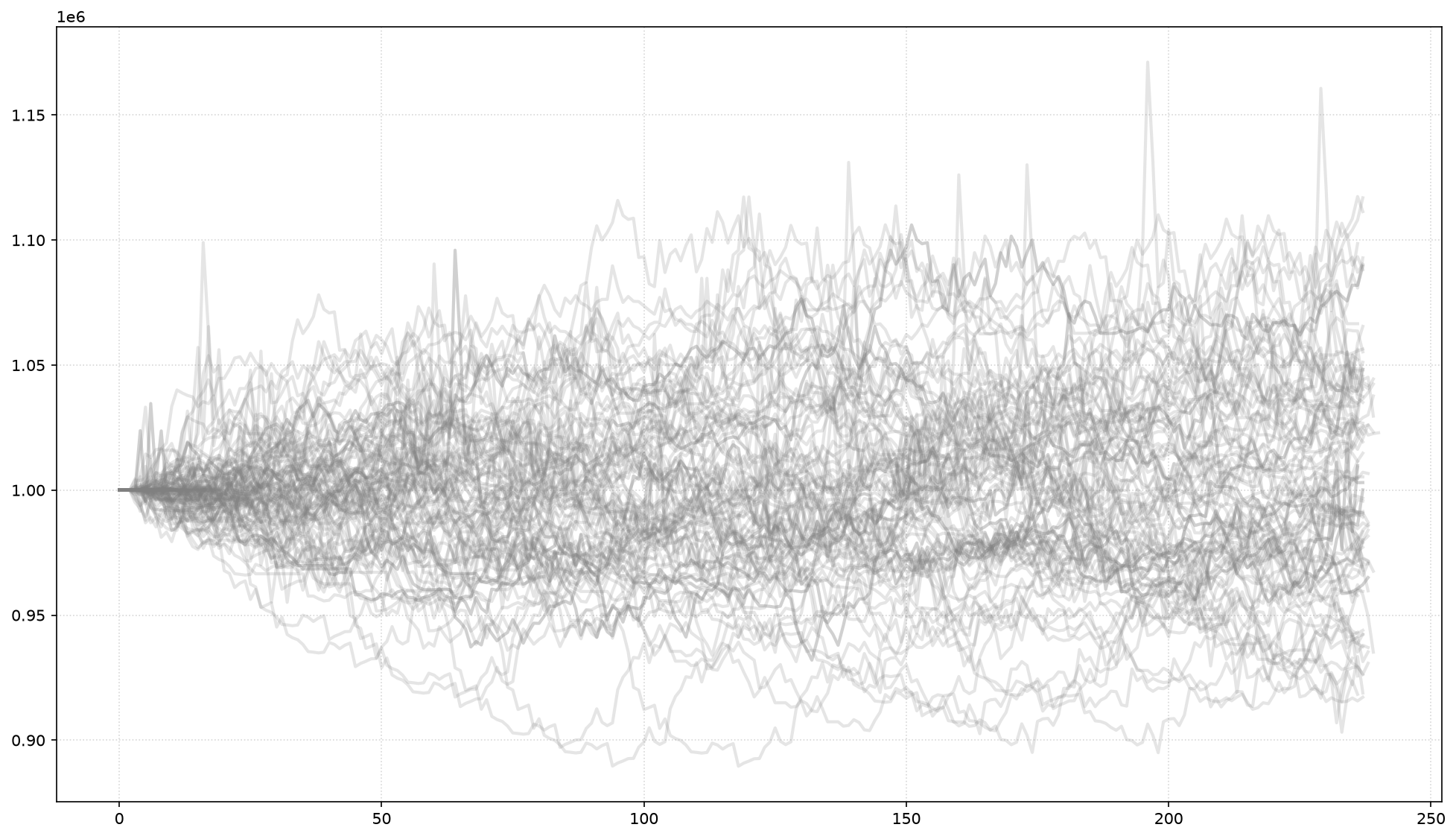
Asset Correlation
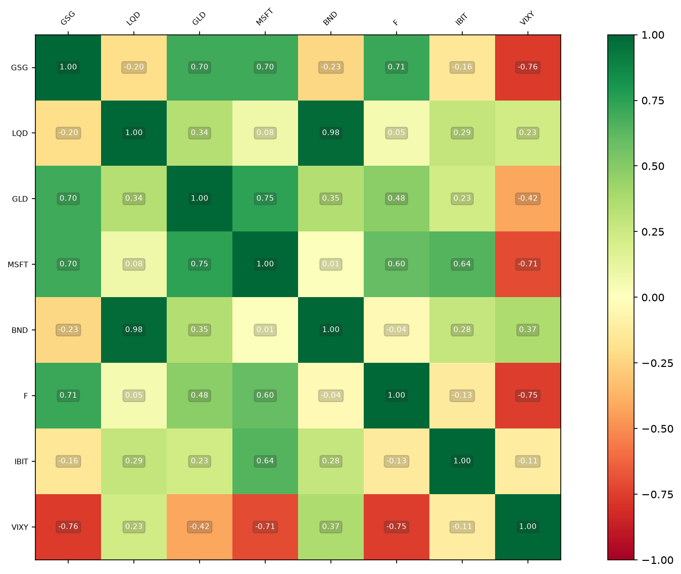
Understanding the correlation between assets in a feed is vital for diversification. feed.to_timeseries().plot_corr() generates a correlation matrix plot, visually representing the statistical relationship between the price movements of different assets in our feed. High positive correlation means assets move similarly, while negative correlation indicates opposite movements. This plot helps identify diversification benefits or hidden risks.
feed.to_timeseries().plot_corr(fontsize=7);